Renewable energy in charts: An evolving landscape

Governments in OECD countries and elsewhere have made commitments and targets in relation to a transition away from fossil fuels and toward renewable energy, not only in respect of electricity generation, but across all energy consumption within their economies generally. As we move into the early days of 2024, I thought it might be useful to capture, in a series of charts, just where we are. Many people adopt and espouse views on this subject without reference to the data that is readily available. This article attempts to identify some key factors with supporting charts.
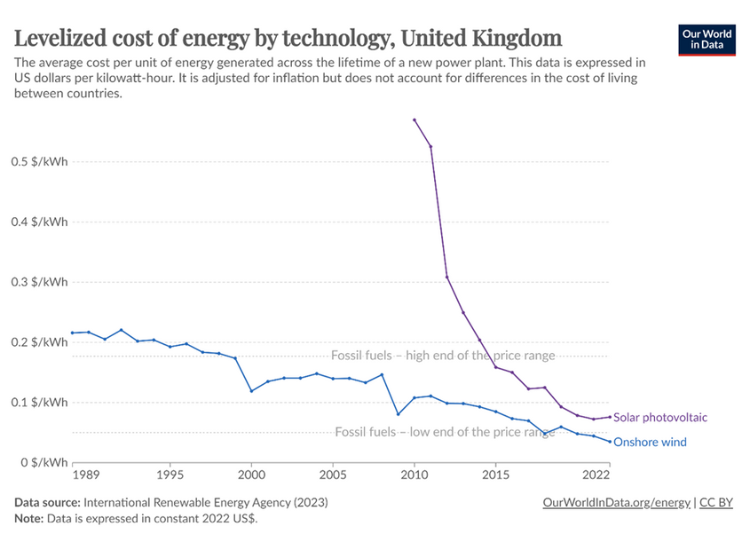
Up until a few years ago, there was a viability gap between thermal plants powered by fossil fuels and non-dispatchable plants (solar voltaic and wind). As chart 1 demonstrates, this is no longer the case. Accordingly, these traditional renewable technologies no longer need feed-in tariffs or other subsidy arrangements to create their commercial viability, meaning both sponsors and lenders can justify such projects.
But it is not correct to say they are the cheapest form of energy from the perspective of the country as a whole, because their intermittency means that each megawatt (MW) of capacity has to be backed up either by a MW of dispatchable plants, or there needs to be substantial investment in storage technologies.
The viability of solar plants in particular, as seen from Chart 1, is largely attributable to the decline in the cost of the solar panels.
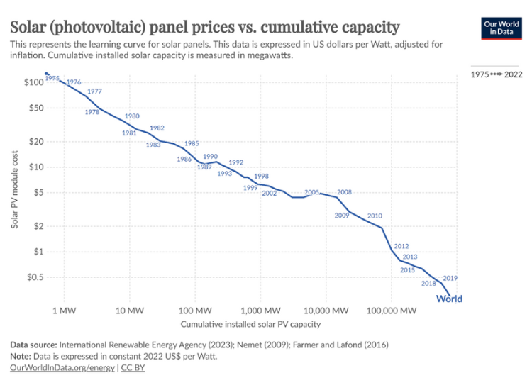
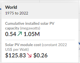
In Chart 2, it can be seen that the price per watt has declined from $100/watt to 27¢/watt over the 45 years from 1976 to 2022. Even 22 years ago (2000), the cost was a little over $5/watt.
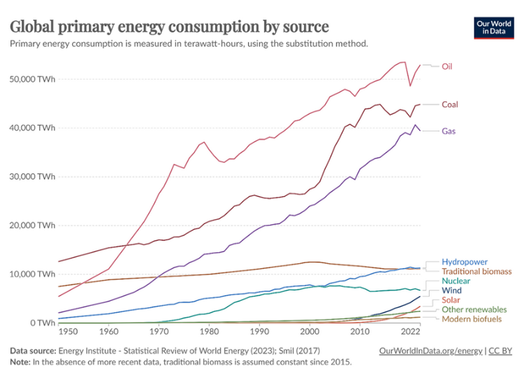
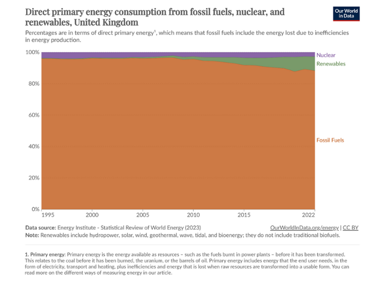
However, while there is the common perception that the growth in renewables is dominant, if we look at global energy consumption – i.e., not only electricity, but also transport, aviation, industry, etc. – the growth in fossil fuels far outstrips the growth in renewable energy.
This is illustrated in Chart 3, which tracks the development of the relevant technologies from 1950 to 2022.
The chart gives some measure of the distance that needs to be travelled in order to achieve ‘Net Zero’.
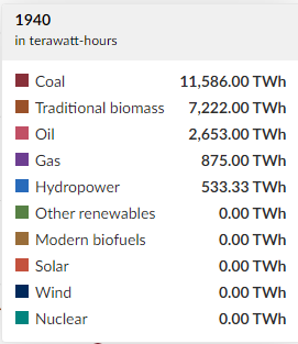
In fact, if we dwell on ‘Net Zero’, the target date currently adopted in the UK is 2050, which is 26 years away. If we look at the past 28 years – going back to 1994, Renewables have gone from 0.29% of energy consumption in the UK to 9.02% now.
The ability to maintain that pace will depend on:
- Investment availability
- Resources availability
- Technology development
The jury is out on each of these factors.
You will notice a slight decline in Nuclear over the 28 years.
On a global basis, it is truly depressing that the growth in Renewables over the past 28 years has been almost entirely offset by the decline in nuclear power generation.
In 1994, the combination of Renewables and Nuclear was 36.2%; 28 years later in 2022, the combined total was 39.0%.
It remains to be seen whether the development of the small modular nuclear reactor will reverse the trend.
These reactors deliver about 300MW capacity for an estimated capital cost of $1 Billion. The problem is that many countries have a deep concern about the safety of the technology and/or the marginal cost of the power produced.
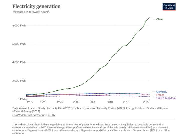
Chart 6 dramatically illustrates that while China was generating the same amount of electricity as each of Germany, France and the UK in the mid/late 1980s – at around 400 TWh per annum – this is no longer the case.
By 2022, it would have been fair to say that in terms of power generation, the Western European countries had hardly changed over the previous 35 years. China, by contrast, now generates around twenty times the electricity produced by each of the major economies of Europe, thanks in the main to the reforms of Deng Xiaoping.
Any efforts to achieve transition will need to be truly international and include both the rapidly-growing economies and their established Western counterparts.
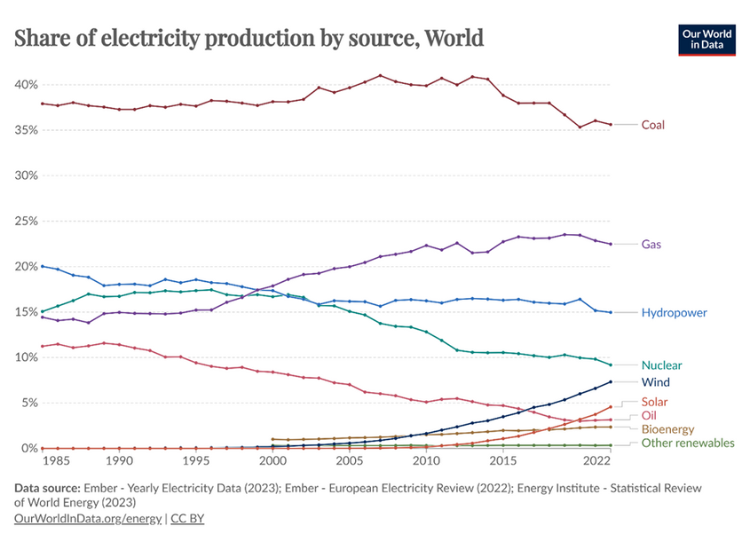
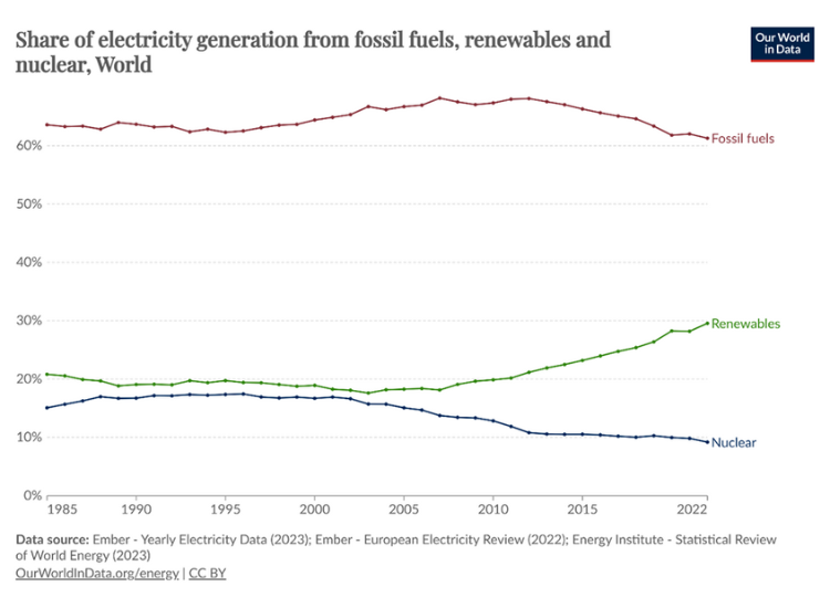
Looking again at the technologies fueling electricity generation around the world, over the past 37 years, Chart 7 indicates the decline in Hydro and Nuclear from 35% to 24.3% a decline of nearly 11%, whilst Solar and Wind have risen from 0% to 12%.
In global terms, therefore, not much has yet been achieved. Country-by-country analysis shows that the OECD countries have made some progress, but this has been largely offset by the lack of political commitment to the transition process in less affluent jurisdictions.
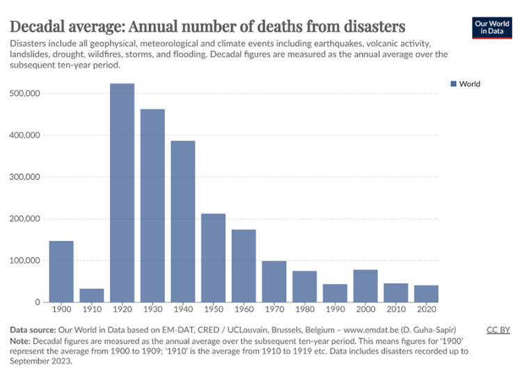
| The last of the charts indicates the welcome trend of reduced deaths (on a worldwide basis) from natural disasters. This data is included here because the common perception is the opposite of what the data shows.
The improvement is partially due to better logistics in handling disasters, greater international co-operation, and improved forecasting. In the 1920s and 30s, there were major famines in Ukraine and China. Whatever the direction of the climate, it has not yet resulted in a rise in fatalities. But how long we can reasonably expect this situation to persist is not clear. |
 hbspt.cta.load(494176, ‘1f053ea0-e005-4726-8b9f-b4a2529a6484’, {“useNewLoader”:”true”,”region”:”na1″});
 Source of charts: https://ourworldindata.org/